Winnebago Owner’s App
Creating a companion app for Winnebago’s RV posed a unique set of challenges. Ensuring seamless integration with diverse RV models, accommodating various user preferences, and designing an intuitive interface that caters to both novice and experienced travelers were primary considerations. Additionally, addressing connectivity issues for remote locations and implementing features that enhance the overall travel experience without overwhelming users presented intricate challenges.
This endeavor required a balance between technological innovation and user-friendly design to deliver a comprehensive and engaging companion app for Winnebago’s discerning customer base.
Client
Winnebago Industries Inc.
Lead Roles
UI, UX, & Animation
Supporting Roles
Developer hand-off
Project Timeline
Q1 2022
UX & UI Design
Joining an ongoing project emphasized the necessity of adaptability and expansion within a evolving design system. It was imperative that each additional design decision and the introduction of new UI or UX patterns seamlessly integrated with the established framework to avoid user confusion and the need for relearning.
Established Design System Patterns
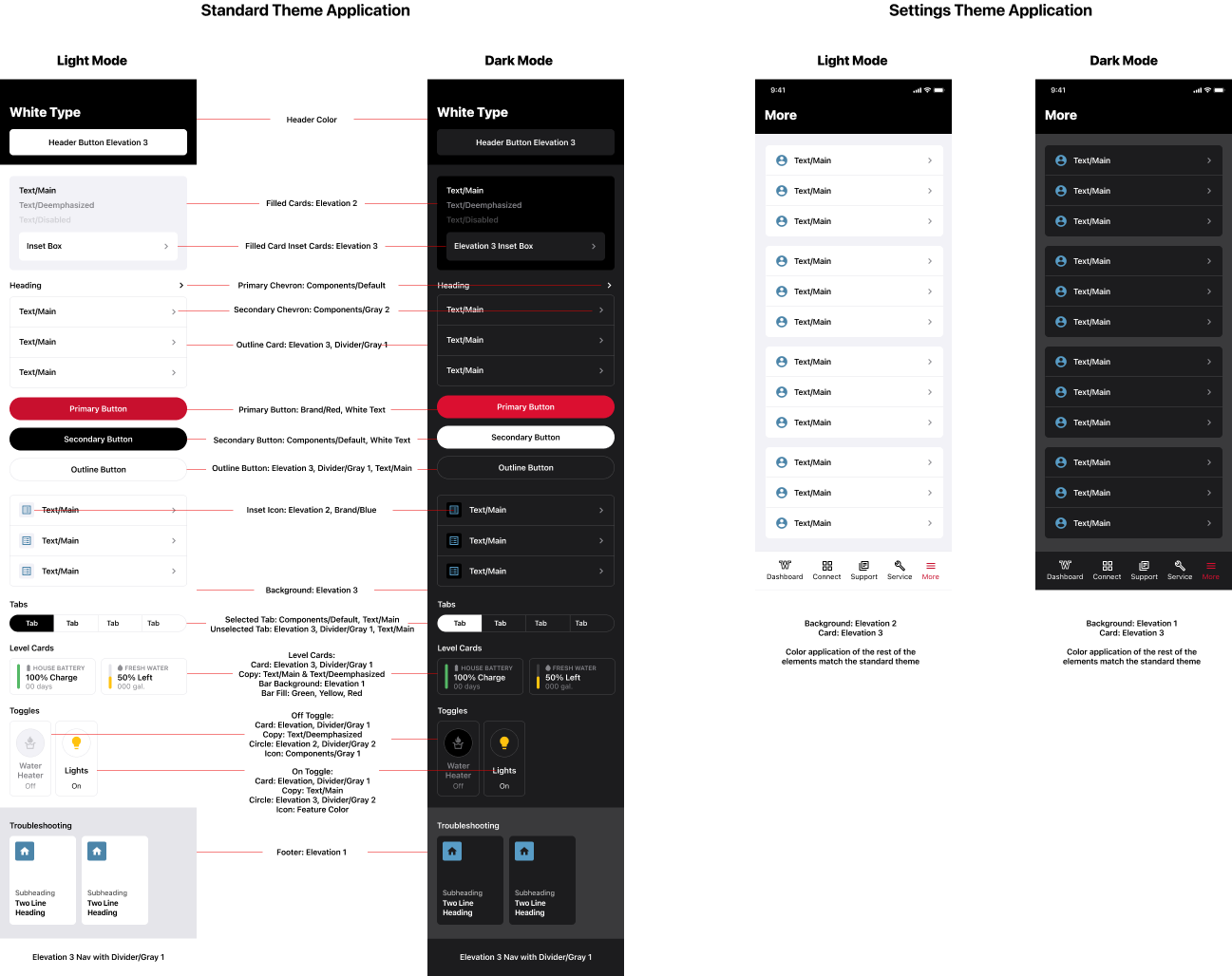
Applied Styles to Novel Screens

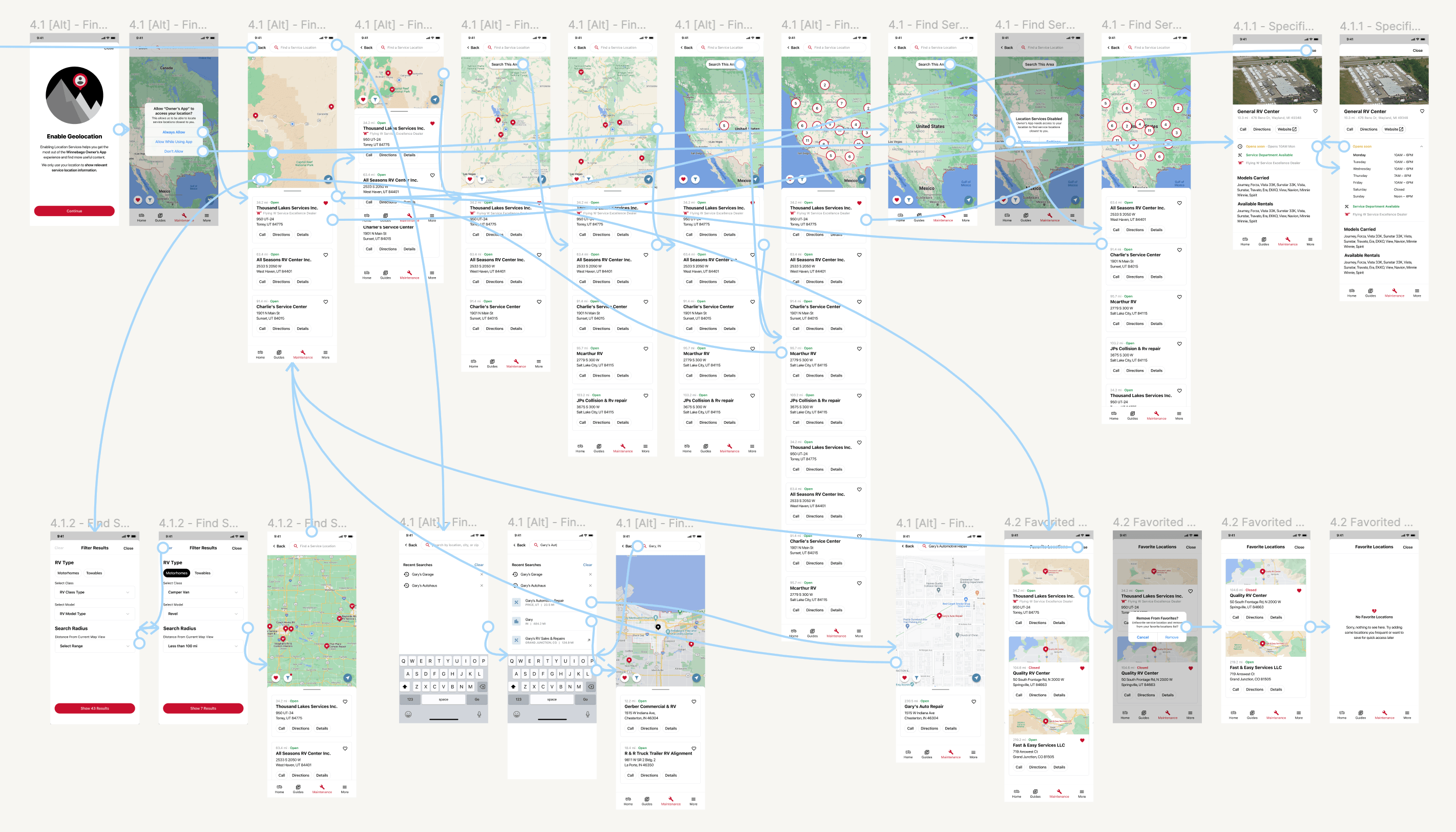
I employed a rigorous testing approach to ensure seamless functionality and an optimal user flow. Leveraging clickable prototypes in Figma, I conducted extensive testing sessions to validate the app’s features and interactions. This meticulous process allowed me to identify and address potential usability issues, refine user pathways, and fine-tune the overall user experience. By utilizing Figma’s capabilities for prototyping and testing, I played a key role in enhancing the app’s reliability and usability, ensuring a user-friendly and intuitive interface.
UI Animation
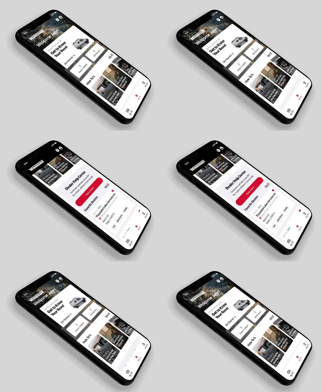
In my design process, I harnessed the capabilities of Adobe After Effects to meticulously craft detailed UI interactions. This not only served as a comprehensive visual guide for developers, facilitating a seamless implementation of our vision, but also played a pivotal role in gaining client approval. The intricacies of the animations not only clarified the intended user interface behaviors but also emphasized the importance of delivering a satisfying user experience. This emphasis on user satisfaction proved instrumental in instilling confidence in our design direction and ensuring alignment with both developer execution and client expectations.
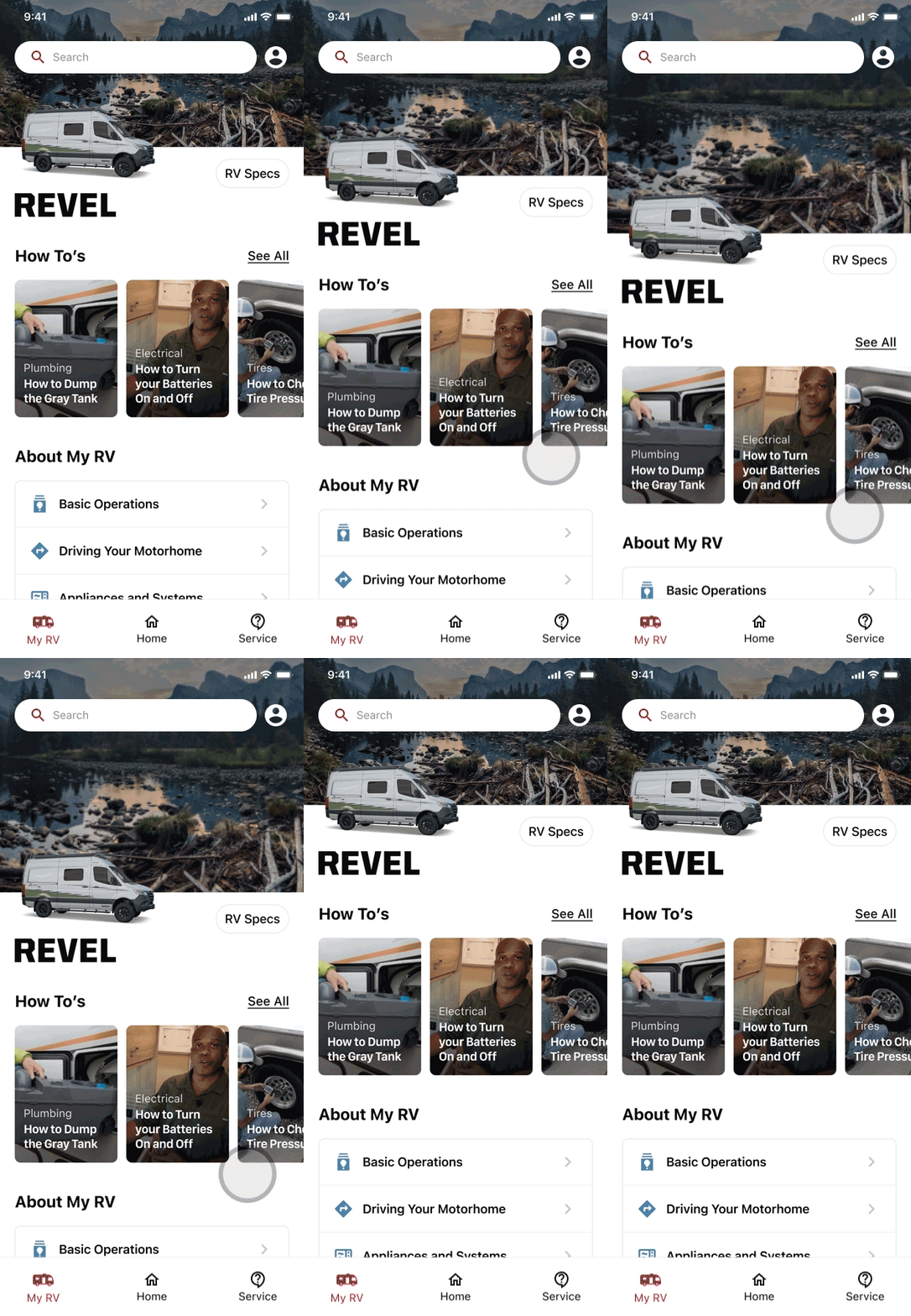
Home screen refresh interaction
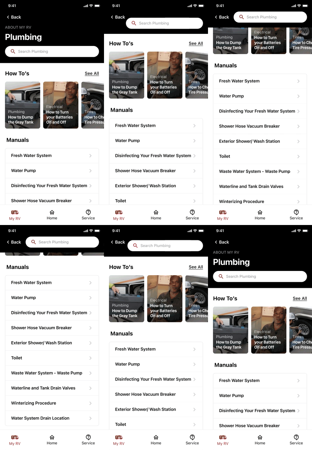
Scroll on service manual section
Animation mocked up in device for client review
Conclusion
Let's build something together.
Give me a holla, shout, aloha, howdy, or hola.
Hello@joshuavk.com or the form below both work fabulously.

